

Web design · Mobile First & UX
Mobile-firstWhy responsive web design is essential for businesses in Germany
The internet is no longer „desktop-first“. Over 60 % of website visits come from smartphones — and Google assesses your site based on its mobile version. This guide explains what responsive web design means for SEO, user experience and conversions.
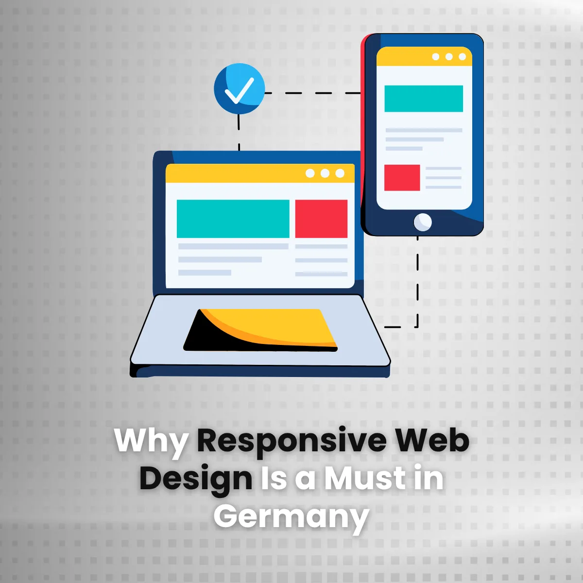
- Mobile internet use
- Over 95 %Germans are going online via mobile
- traffic share
- More than 60 %website visits come from smartphones
- Google review
- Mobile-first indexcrucial for the ranking since 2019
- Effort
- A codebaseinstead of separate desktop and mobile versions
Overview
The internet is long past being „desktop first“. In Germany, too, people are increasingly surfing, shopping and interacting with companies via their smartphones. If your website is not optimised for mobile users, you are already lagging behind the competition.
Responsive web design ensures that your website automatically adapts to all screen sizes — whether desktop, tablet or smartphone — and provides an optimal user experience on every device.
In this post, you will learn why the mobile-first approach is no longer an option for businesses in Germany, but a necessity — from Google visibility and conversion rates to legal accessibility.
Rising mobile usage in Germany
Germany is among the countries with the highest smartphone usage in Europe. Current figures show:
- Over 95 % of Germans access the internet via mobile devices
- More than 60 % of visits to the website come from smartphones
- The proportion of mobile online purchases is steadily increasing every year
If your website is not optimised for mobile devices, you are most likely losing potential visitors, leads and sales.
Source: Statista (2024), Exploding Topics
Enhanced user experience
User experience (UX) is crucial for trust, dwell time and interaction on your website. Responsive web design improves UX through:
- Easy to read and simply navigable content
- Automatic layout adjustment to screen sizes
- No need to zoom or scroll horizontally
- Click-friendly buttons and forms
A better mobile user experience leads to lower bounce rates, longer sessions and higher engagement — all factors that have a positive impact on your digital performance.

Is your website ready for mobile responsive?
With Synext IT you make your website responsive, mobile-friendly and future-proof — for a better user experience, higher visibility and more conversions.
Better SEO performance through responsive web design
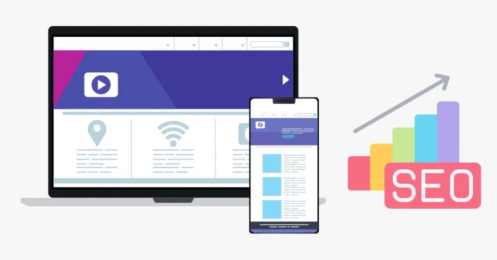
Google has been using the principle of since 2019 mobile-first indexing — which means: The mobile version of your website is decisive for the ranking in search results.
Responsive Web design helps you to:
- keeping content consistent across devices
- improving Core Web Vitals (loading speed, stability, interactivity)
- To simplify crawlability and indexing by search engines
- To avoid SEO issues that can arise when desktop and mobile versions are separate
In short, responsive design is crucial to maintaining and expanding your visibility on Google—especially in the highly competitive German market.
Source: Google Developers
Higher conversion rates
Mobile users expect websites to be fast, simple and intuitive. If your site loads slowly on a smartphone, is cluttered or difficult to use, users will leave it before they convert.
Responsive web design supports your conversion goals by:
- Optimised mobile navigation
- Clearly recognisable and easy-to-tap call-to-actions (CTAs)
- Simplified forms and contact options
- Integration of mobile features such as click-to-call or map links
Better mobile usability = more leads and higher sales.
Responsive design or separate mobile site?
Many older websites solve the mobile problem with a second page at m.your-domain.de. A direct comparison shows why this approach rarely pays off these days:
| criterion | Responsive Web Design | Dedicated mobile site |
|---|---|---|
| Codebase | A single codebase for all devices | Two separate systems with double the effort |
| SEO | One URL, unique signals, no duplicates | The risk of duplicate content and incorrect redirects |
| care effort | Content and fixes are maintained once | Every change must be implemented twice |
| New devices | Flexible grids adjust automatically | New breakpoints require additional development |
| Accessibility | Scalable fonts and layouts out of the box | Accessibility must be ensured twice |
| Costs | One-off development, low ongoing costs | Higher development and maintenance costs |
Greater reach and better accessibility
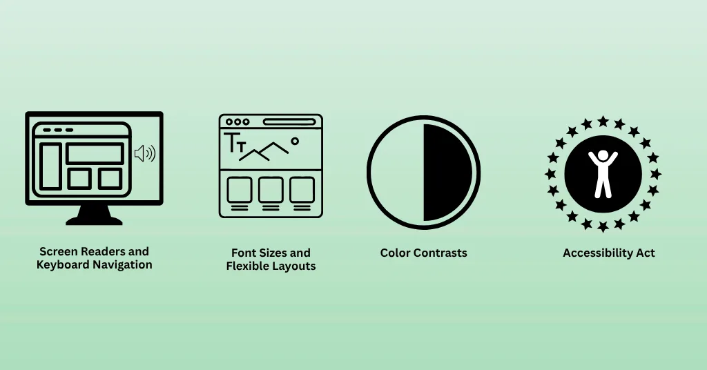
A responsive website is inclusive and reaches a wider audience — including people with disabilities or users of assistive technologies.
Key benefits
- Support for screen readers and keyboard navigation
- Scalable font sizes and flexible layouts
- Improved colour contrast and compliance with accessibility standards
- Compliance with statutory regulations such as the Accessibility Act 2025 in Germany
A website designed to be mobile-first and accessible not only fulfils legal requirements, but is also a sign of social responsibility.
Connection to the Accessibility Act
Mobile responsiveness is one of the requirements that the European Accessibility Act (BFSG) has placed on websites since 28 June 2025. Anyone who develops with mobile optimisation in mind is therefore already fulfilling a central testing criterion. Read more in the post Accessibility Act 2025 — or directly in the free Accessibility Check.
Cost-effectiveness of responsive web design
Why create and maintain two separate websites (for mobile devices and desktop) when one solution is enough?
Responsive web design is more efficient because:
- It reduces development and maintenance effort
- only one codebase and content management system needs to be managed
- All device types are covered by a single website
- updates and bug fixes only have to be implemented once
In the long run, this saves time and money — whilst ensuring consistent performance across all devices.
secure a competitive advantage
Your competitors are already investing in mobile optimisation — and your customers expect it. A responsive, SEO-optimised website:
Boosts your brand’s credibility
A website that works smoothly on a smartphone conveys a sense of attention to detail — even before a single word of your content has been read.
Helps you stay ahead of the competition
Mobile performance is a ranking factor. Where content is comparable, the technical implementation determines the ranking.
Provides a consistent experience
Users switch between devices. A consistent layout ensures that they can find their way around straight away, wherever they are.
Adapts to modern users
Mobile user interfaces such as click-to-call, map links and short forms are now standard, not a bonus.
In Germany’s digital economy in particular, responsive web design gives you a decisive advantage.
Future-proofing through responsive web design
The digital world is developing rapidly: foldable displays, voice search and new forms of interaction are constantly presenting new demands. Your website needs to be adaptable.
Responsive Web Design
- Adapts to new devices and screen sizes
- Works reliably across different browsers and operating systems
- Prepare your website for voice control and AI integration
- Supports sustainable growth with minimal development effort
Thinking ‘mobile-first’ isn’t just about being successful today — it’s also about ensuring your website remains scalable and relevant for the future.
Is your website really mobile-friendly?
Five questions, answered honestly. The result is not a technical assessment, but an indication of how urgent the need for action is.
Brief self-assessment
0 of 5 answered
If you hesitate at any of these questions: acting early saves costs, effort and lost enquiries later on.
Let Synext IT make your website mobile-friendly and future-proof
At Synext IT, we design and develop responsive, SEO-optimised websites for forward-thinking companies in Germany.
Our services in the field of responsive web design
From initial analysis to ongoing support.
- Customised layouts for all screen sizes
- Mobile-first UX design and performance optimisation
- Technical SEO structure & Core Web Vitals optimisation
- WCAG-compliant design for accessibility and legal certainty
- Ongoing support, maintenance & analysis
- Migration of existing pages to a responsive grid
Ready for a mobile user experience that delivers results?
Frequently Asked Questions (FAQ) — Mobile First & Responsive Web Design
What is the advantage of a mobile-first approach in responsive web design?
A mobile-first approach ensures that your website is optimised for small screens first and then scales up for larger devices. This leads to cleaner code, better performance, faster loading times and a stronger user experience — particularly on smartphones, which now account for the majority of web traffic.
How do businesses benefit from a mobile-responsive website?
A mobile-optimised website helps businesses reach more users, increase engagement and drive conversions. It improves SEO, lowers the bounce rate and ensures a seamless user experience — which boosts visibility and revenue, particularly in mobile-dominated markets like Germany.
Why is a mobile-friendly, responsive website important?
More than 60 % of website traffic comes from mobile devices. If your website isn’t mobile-friendly, users will quickly leave. A responsive design ensures that content is displayed correctly, loads quickly and is easy to navigate — for a better user experience and better Google rankings.
What is the main advantage of responsive web design?
The biggest advantage is the adaptability to different devices. A responsive website automatically adjusts to screen size and orientation, offering a consistent user experience on desktop, tablet and smartphone — without separate designs or duplicate content.
What is a key feature of responsive web design?
A key feature is the use of flexible grids and layouts. These allow content, images and elements to adapt proportionally to different screen sizes — for a fluid and visually consistent presentation on every device.
Can Synext IT help with building a responsive, mobile-first website?
Definitely! Synext IT specialises in mobile-first and SEO-optimised responsive web design. We offer:
- Bespoke designs, tailored to the target audience and brand
- SEO-optimised structure and loading speed
- WCAG and Core Web Vitals conformity
- Ongoing support, updates & technical monitoring
Next step
Measure first, then carry out the alterations.
Most websites fail on mobile due to four or five recurring issues — not because they need a complete overhaul. A quick chat will show where you stand.
- Reply within 24 hours
- 100 % (no obligation)
- Specific findings rather than general guidelines
Performance
Responsive Web Design
Mobile-first layouts, strong Core Web Vitals and accessible usability — designed for businesses that want to be found on mobile devices.
View servicesPersonal advice · Response within 24 hours
 English
  German